This is a sample report. Analyze your own site to get yours.
Through a Stranger’s Eyes
I land on your page, and the first thing that hits me is “Turn a room photo into renders, BOQs, and client approvals”.
Just below it, you explain yourself: “AI renders to procurement docs - one platform”
So I keep reading down - past “Beyond renders - a full design workflow”, “Plans that scale with your studio”, and “Stop sending renders without deliverables”.
Now I want to act, so I start clicking:
I click “Start Free” - it takes me to a sign-in page.
I click “Get Started” - it takes me to a sign-in page.
I click “Contact Us” - it scrolls me to another part of the page.
I've read your page, clicked through every button, and I get what you do - but honestly, I'm still on the fence about whether this is for me.
Screenshots
Above the Fold - Annotated
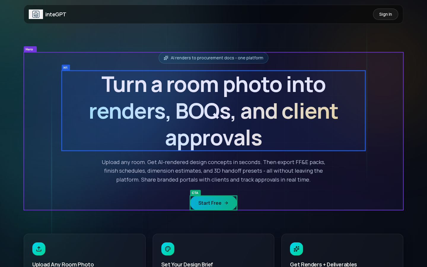
Annotations show key elements detected by the audit
CTA Click Result
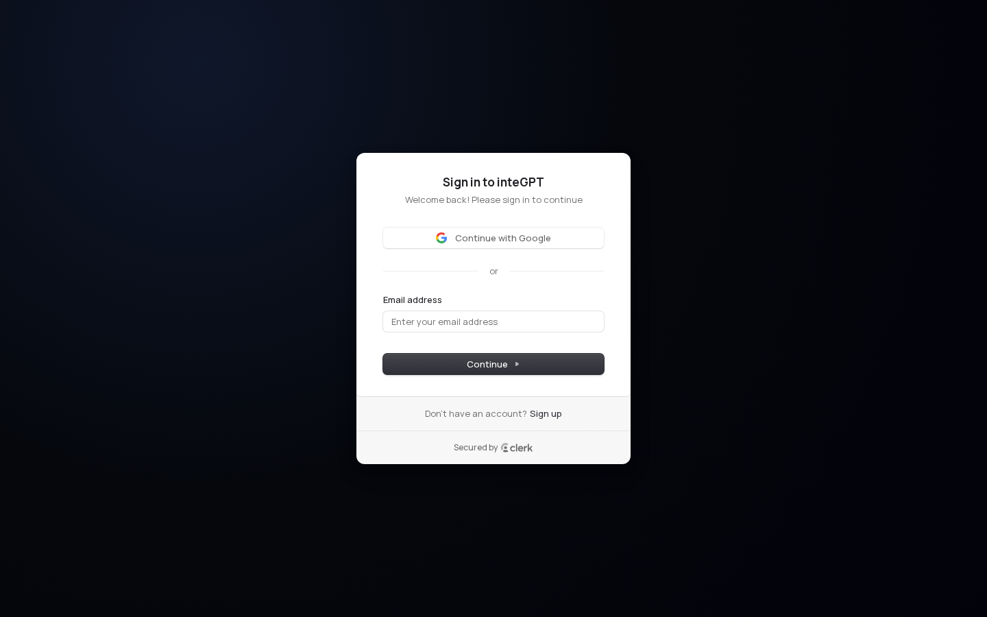
What the visitor sees after clicking the primary CTA
The Brutal Truth
The 'Start Free' CTA sends new visitors to a screen that greets them as 'Welcome back' - a sign-in form, not a signup form - meaning the moment a designer is convinced enough to act, the product actively rejects them as a stranger. With zero social proof anywhere on the page to rebuild that broken trust, and the strongest value statement buried at the bottom, the conversion funnel is functionally broken at its most critical handoff - every dollar spent on traffic and every second spent on copy improvements is wasted until a new visitor clicking 'Start Free' lands on an experience that actually starts them for free.
Top 3 Things to Fix Right Now
Conversion
Clicking 'Start Free' drops visitors onto a screen titled 'Sign in to inteGPT - Welcome back! Please sign in to continue' - language that speaks exclusively to returning users. New visitors who have never used the product see 'Welcome back' and feel confused or excluded. The signup option is a small secondary link ('Don't have an account? Sign up') at the bottom of the modal. This creates cognitive dissonance: the CTA promised a free start, but the destination greets them as if they already have an account. Loss aversion kicks in - visitors assume they missed a step or the free offer requires something they don't have.
Configure Clerk to default the auth screen to the signup tab when traffic arrives via the 'Start Free' CTA (pass a hint parameter like ?intent=signup). The headline should read 'Create your free account' not 'Welcome back'. Alternatively, add a dedicated /get-started landing page that collects email first, then routes to signup.
Conversion
The entire above-fold section - headline, subheadline, CTA - contains no customer logos, testimonial snippets, review counts, or usage numbers. Interior designers and studio owners are a skeptical B2B audience making workflow decisions. Without social proof, the brain defaults to risk-assessment mode and hesitates. The page asks visitors to trust an AI tool with their client deliverables and procurement documents - a high-stakes ask - with zero third-party validation. This is pure authority vacuum.
Add a single trust bar directly below the 'Start Free' button: '★★★★★ Used by 200+ interior studios across India' or logos of recognizable design firms. Even one quoted testimonial from a named designer ('We cut our BOQ prep from 3 hours to 20 minutes - Priya S., Studio Forma') would dramatically increase conversion.
Content Quality
This is a feature summary, not a value statement. It tells designers what the product contains but not what problem it solves or what they stop suffering through.
Stop losing hours between the render your client loves and the documents your contractor needs.
First Impression
7The headline 'Turn a room photo into renders, BOQs, and client approvals' is genuinely specific and workflow-complete, but 'BOQs' is jargon that will freeze non-specialist visitors for 2 of their 5 seconds.
Value Proposition
The value proposition is genuinely customer-centric and workflow-specific. The pill badge 'AI renders to procurement docs - one platform' correctly frames the end-to-end promise before the H1 even loads. The subheadline lists concrete deliverables - 'FF&E packs, finish schedules, dimension estimates, and 3D handoff presets' - which signals deep domain knowledge and builds trust with professional designers. The closing section 'Stop sending renders without deliverables' is the strongest pain-point framing on the page and would actually work better as the H1. The pricing section's note 'real budget estimates in INR' is a smart localization signal for the Indian market. The main gap: nowhere above the fold does the page say who this is for - 'interior designers and studios' only appears in the features section subheadline, leaving architects, contractors, or homeowners unsure if this is meant for them.
CTA Above the Fold
The 'Start Free' CTA is clearly visible above the fold on both desktop and mobile - it's a teal pill-shaped button with an arrow, centered below the subheadline, with adequate whitespace around it. The teal color matches the accent used in the headline, creating visual cohesion but slightly reducing the CTA's standalone pop since it competes with the colored headline text. Both 'Start Free' and 'Get Started' correctly redirect to /sign-in with a dashboard redirect URL, which is the expected behavior for a freemium signup flow - no destination mismatch detected. The CTA copy 'Start Free' is appropriately low-friction. One improvement: adding a micro-line like 'No credit card required' directly under the button would reduce signup hesitation at zero cost.
Suggested Rewrites
Current
“Turn a room photo into renders, BOQs, and client approvals”
↓ Rewrite
Rewrite
“Turn a room photo into renders, procurement docs, and client approvals”
A/B Test Alternatives
“From site-visit photo to approved renders and procurement docs - in minutes, not days”
“Stop losing clients because your renders don't come with deliverables”
Current
“Created by inteGPT”
↓ Rewrite
Rewrite
“Upload a room photo. Get AI renders, FF&E packs, BOQs, and client approval portals - all in one platform. Built for interior designers and studios.”
A/B Test Alternatives
“inteGPT turns any room photo into AI renders, procurement documents, and client-approved deliverables in minutes. Free plan available.”
“Interior designers use inteGPT to go from site-visit photo to client sign-off - renders, BOQs, finish schedules, and 3D handoff files included.”
Current
“(missing above the fold - first mention is 'Every feature interior designers and studios actually need' in the features section)”
↓ Rewrite
Rewrite
“Add a single line directly under the H1: 'Built for interior designers and design studios'”
A/B Test Alternatives
“Add to the pill badge: 'For interior designers - AI renders to procurement docs - one platform'”
“Add below the CTA: 'Trusted by interior designers and studios across India'”
Current
“Stop sending renders without deliverables”
↓ Rewrite
Rewrite
“Move this line to the hero as a subheadline or replace the pill badge with it: 'Stop sending renders without deliverables'”
A/B Test Alternatives
“Use as pill badge: 'Renders without deliverables cost you clients'”
“Use as H1 variant: 'Stop sending renders without deliverables - inteGPT adds BOQs, FF&E packs, and client approvals automatically'”
Conversion Effectiveness
6The 'Start Free' CTA lands on a sign-in screen that defaults to returning users, creating immediate friction for new visitors who came expecting to start for free - the signup path is buried in a small 'Don't have an account? Sign up' link below the fold of the modal.
Conversion Killers
Primary CTA destination mismatch for new users
“Start Free”
Clicking 'Start Free' drops visitors onto a screen titled 'Sign in to inteGPT - Welcome back! Please sign in to continue' - language that speaks exclusively to returning users. New visitors who have never used the product see 'Welcome back' and feel confused or excluded. The signup option is a small secondary link ('Don't have an account? Sign up') at the bottom of the modal. This creates cognitive dissonance: the CTA promised a free start, but the destination greets them as if they already have an account. Loss aversion kicks in - visitors assume they missed a step or the free offer requires something they don't have.
Current
“Start Free”
↓ Rewrite
Rewrite
“Start Free - No Card Needed”
A/B Test Alternatives
“Join 500+ studios already exporting BOQs in minutes”
“Stop losing hours on procurement docs - start free today”
Zero social proof above the fold
“(no testimonials, logos, or trust signals visible in the hero)”
The entire above-fold section - headline, subheadline, CTA - contains no customer logos, testimonial snippets, review counts, or usage numbers. Interior designers and studio owners are a skeptical B2B audience making workflow decisions. Without social proof, the brain defaults to risk-assessment mode and hesitates. The page asks visitors to trust an AI tool with their client deliverables and procurement documents - a high-stakes ask - with zero third-party validation. This is pure authority vacuum.
Current
“(no testimonials, logos, or trust signals visible in the hero)”
↓ Rewrite
Rewrite
“Trusted by 200+ design studios - Start Free”
A/B Test Alternatives
“'We exported our first FF&E pack in 8 minutes' - add your studio to the list”
“Stop doing procurement manually - 200+ studios already switched”
Hero subheadline - feature list masquerading as a value proposition
“Upload any room. Get AI-rendered design concepts in seconds. Then export FF&E packs, finish schedules, dimension estimates, and 3D handoff presets - all without leaving the platform. Share branded portals with clients and track approvals in real time.”
This reads as a feature inventory, not a benefit statement. It lists seven distinct capabilities in one paragraph, triggering cognitive overload (Hick's Law applied to copy). The visitor's brain has to process FF&E packs, finish schedules, dimension estimates, 3D handoff presets, branded portals, and approvals simultaneously. The actual emotional payoff - saving hours, winning more clients, looking more professional - is never stated. Interior designers don't buy 'exports'; they buy time back and client confidence.
Current
“Upload any room. Get AI-rendered design concepts in seconds. Then export FF&E packs, finish schedules, dimension estimates, and 3D handoff presets - all without leaving the platform. Share branded portals with clients and track approvals in real time.”
↓ Rewrite
Rewrite
“Go from a site-visit photo to client-approved renders and procurement documents in minutes - not days.”
A/B Test Alternatives
“Studios using inteGPT deliver renders, BOQs, and client sign-off 10x faster than manual workflows.”
“Stop spending evenings on BOQs. Upload a photo, get renders and procurement docs your clients can approve today.”
Pricing page - INR-only pricing with no context for non-Indian visitors
“₹0 / ₹1299 / ₹4999 / ₹13999 PER MONTH”
All pricing is displayed exclusively in Indian Rupees with no currency toggle or USD equivalent. For any visitor outside India, this creates immediate uncertainty about whether the product is available to them, whether pricing is correct, and whether support will be accessible. This silently kills international conversions. Even for Indian visitors, showing ₹4999 without anchoring it against the time saved (e.g., '₹4999/month vs. 20+ hours of manual BOQ work') leaves the price feeling abstract.
Current
“₹0 / ₹1299 / ₹4999 / ₹13999 PER MONTH”
↓ Rewrite
Rewrite
“Pro Designer - ₹4999/month (≈ $60 USD) - pays for itself after one client project”
A/B Test Alternatives
“Pro Designer - ₹4999/month - 220 credits covers 20+ full project deliverable sets”
“Pro Designer - less than the cost of one hour of manual BOQ work, per month”
Contact email exposed as personal Gmail
“koustubh.lap18@gmail.com”
The contact email at the bottom of the page is a personal Gmail address. For a B2B SaaS tool targeting design studios and agencies, a personal Gmail destroys trust instantly. It signals the product is a side project, not a serious business. Studio owners considering handing over client data and procurement workflows to a platform will not do so if the company's contact is a personal email. This is a trust-killer that undermines every other credibility signal on the page.
Current
“koustubh.lap18@gmail.com”
↓ Rewrite
Rewrite
“hello@integpt.com”
A/B Test Alternatives
“support@integpt.com - we respond within 24 hours”
“Book a 15-minute demo - [calendar link]”
Social Proof Assessment
There is zero social proof on this page. No testimonials, no customer quotes, no studio logos, no review counts, no 'used by X designers' claim, no case study references, no press mentions. The page makes bold claims about replacing manual workflows and delivering procurement documents in minutes, but offers no third-party validation whatsoever. For a B2B tool targeting professional interior designers and studios - people who are being asked to trust AI with client-facing deliverables - the complete absence of social proof is a critical conversion gap. The only human signal on the entire page is a personal Gmail address, which works against trust rather than for it.
CTA Flow Assessment
Clicking 'Start Free' lands on a Clerk-powered auth screen (screenshot #2 shows a centered white modal on a dark background). The modal is titled 'Sign in to inteGPT' with the subtext 'Welcome back! Please sign in to continue.' It offers 'Continue with Google' as the primary option, an email field, and a 'Continue' button. The destination is technically correct - it's an auth screen that leads to the dashboard - but the framing is wrong for new users. The headline says 'Welcome back' and the default view is a login form, not a signup form. New visitors must find and click the small 'Don't have an account? Sign up' link at the bottom of the modal to start their free account. This is a friction point: the CTA promised 'Start Free' but the destination greets them as a returning user. The Clerk integration itself is clean (secured by Clerk badge visible, Google SSO available, minimal fields), so the fix is purely in the default state and headline copy of the auth screen, not the infrastructure. The 'Get Started' CTA across the pricing section also routes to the same /sign-in screen - consistent destination, same friction issue for new users.
Content Quality
6The page describes what the product does with reasonable clarity but never explains why a designer should trust AI to handle procurement documents and client approvals - the highest-stakes parts of their workflow - leaving the most important objections completely unanswered.
Jargon Found
Features vs Benefits
The page leans heavily feature-first. For example, 'Render multiple angles of the same room and the AI matches colors, materials, and lighting across every view automatically' describes the mechanism but skips the benefit - which is that clients stop rejecting renders because the sofa looks different in every shot. Similarly, 'Upload your team's product catalog with SKUs and pricing, then generate designs that feature actual furniture and finishes you can source and procure' lists the action without landing the payoff: you stop presenting renders your client loves but you can't actually build. The strongest benefit language on the page is in the CTA section - 'go from a site-visit photo to client-approved renders, procurement documents, and 3D handoff files - in minutes, not days' - that time contrast is the clearest value statement on the entire page and it's buried at the bottom.
Missing Content
- ☐How accurate are the BOQs and budget estimates - if a client approves a budget based on inteGPT's INR estimates and the actual procurement costs are different, who is responsible?
- ☐What happens to my client's project data and room photos - are they stored, used to train the AI, or shared with anyone?
- ☐How long does it actually take to go from photo upload to a finished FF&E pack - the page says 'renders in seconds' but what about the full deliverable set?
- ☐Can I see a real example output - an actual render, an actual BOQ, an actual client portal - before I sign up?
- ☐The page targets Indian studios with INR pricing but uses terms like LiDAR and SketchUp/Revit plugins - does this work with Indian construction standards and local supplier catalogs?
- ☐What does the AI do when the room photo is dark, cluttered, or low quality - does it fail silently or tell me?
- ☐If I use the white-label client portal, does the client ever see the inteGPT brand or know what tool I'm using?
- ☐Credits expire? Roll over? What happens to unused credits at the end of the month?
- ☐How is this different from Midjourney or other AI image tools my clients have already heard of - why should I pay for this instead?
Suggested Rewrites
Current
“AI renders to procurement docs - one platform”
↓ Rewrite
Rewrite
“Stop losing hours between the render your client loves and the documents your contractor needs.”
A/B Test Alternatives
“The only AI design tool that takes you from site photo to signed-off procurement pack - without switching apps.”
“Interior designers spend days turning approved renders into BOQs, FF&E packs, and handoff files. inteGPT does it in the same step.”
Current
“Upload any room. Get AI-rendered design concepts in seconds. Then export FF&E packs, finish schedules, dimension estimates, and 3D handoff presets - all without leaving the platform. Share branded portals with clients and track approvals in real time.”
↓ Rewrite
Rewrite
“Take a photo of any room - from a site visit or your phone. In seconds, you get AI render concepts to show your client. Choose the one they like, and inteGPT builds the full package: furniture and finish lists, budget estimates, dimension notes, and files your contractor or 3D modeler can use directly. Your client approves through a branded link. You never chase a reply over WhatsApp again.”
A/B Test Alternatives
“Designers using inteGPT go from a raw site photo to a client-approved render, a procurement-ready furniture list, and contractor-ready files - in one session, not one week.”
“Most designers finish a render and then spend two more days building the documents around it. inteGPT generates the render and every document at the same time, from the same photo.”
Current
“Catalog-Constrained Generation”
↓ Rewrite
Rewrite
“Renders Built From Your Actual Product Catalog”
A/B Test Alternatives
“Show Clients Furniture You Can Actually Source”
“Stop Presenting Renders You Can't Procure”
Current
“Estimate room measurements directly from a photo using AI vision, a calibrated reference object, or your own LiDAR survey data.”
↓ Rewrite
Rewrite
“Get usable room dimensions from a photo alone. Point at a door, a chair, or any object you know the size of - inteGPT estimates the rest. Or import your own survey data if you have it.”
A/B Test Alternatives
“Designers using the Dimension Assistant skip the separate measurement visit entirely - AI estimates room dimensions from the same photo used for the render.”
“No tape measure. No second site visit. Upload a photo, identify one reference object, and get dimension estimates you can use in your BOQ.”
Current
“Stop sending renders without deliverables”
↓ Rewrite
Rewrite
“Stop sending renders without deliverables - your clients are waiting on documents, not just images.”
A/B Test Alternatives
“Every render you send without a BOQ is a follow-up email you'll have to write. inteGPT sends both at once.”
“Clients don't just want to see the design. They want to know what it costs and when it starts. inteGPT gives you both outputs from one photo.”
Current
“For freelancers and homeowners”
↓ Rewrite
Rewrite
“For independent designers taking on client projects”
A/B Test Alternatives
“For solo designers who need professional outputs without agency overhead”
“For freelance interior designers ready to deliver faster than a full studio”
Current
“Credits power everything - 1 credit for a draft render, 2-8 for higher resolutions, and 2-4 for workflow exports like FF&E packs or BOQs.”
↓ Rewrite
Rewrite
“Each project uses credits based on quality and outputs. A typical client project - draft renders, one high-res final, and an FF&E pack - uses around 12-15 credits. The Pro Designer plan's 220 credits covers roughly 15 full client projects per month.”
A/B Test Alternatives
“Pro Designer's 220 credits is enough for approximately 15 complete client projects per month, including renders and procurement exports. Not sure? The free plan lets you test with 3 credits before you commit.”
“Worried about running out mid-project? Top-ups are available any time, and unused credits roll over. One client project typically uses 10-15 credits from start to signed-off deliverable.”
What You're Doing Well
- ✓First impression clarity: inteGPT lands a strong first impression for its target audience - interior designers and studios - because the H1 immediately names the input ('a room photo'), the outputs ('renders, BOQs'), and the business outcome ('client approvals').
Generated by firsteyes AI · Jun 4, 2026
Want this for your site?
Analyze My Website